Forms and Screens allow you to assemble your app in a highly flexible and straightforward way.
You can design and configure almost every form your app users see, allowing you to have full control over the user experience.
In our platform, Forms and Screens serve two distinct yet complementary functions:
- Forms are designed for data collection and submission. They are the tools your users interact with to input information into the platform.
- Screens are used to organize and present that information, enabling navigation, displaying data lists, maps, or detailed views within the app.
Understanding this distinction is key to building intuitive, effective applications. This article outlines the purpose of each component and provides a breakdown of the available Screen types.
Forms
Forms are the foundation of data entry in your app.
They are created using a drag-and-drop designer, allowing you to build pages with a wide variety of field types, such as text, number, GPS, photo, signature, checklist, and more.
Forms are ideal for capturing information during inspections, field reports, safety audits, check-ins, or any workflow requiring user input. Once submitted, the captured data is sent to the platform for review, export, or automation through triggers and workflows.
Screen Types
There are a number of Screen types to choose from. Each type provides a template for a specific user experience. The types available currently are:
List of Data
Provides a list display of rows from a specified Data Source. This is useful when you want to provide your users with quick lists. Lists can be of products, contacts, tickets, and pretty much anything else you can think of. Data Sources can be connected to external systems so that you can feature rows from other systems in your app.
Details Screen
One of the most flexible options. This Screen type allows you to display the specifics of a selected row from a Listing screen. Or you can display a static set of information, such as a menu.
Board of Icon
This screen type allows you to create your own custom icon layouts as a replacement start screen of your app. Or as drill-down screens that provide the icons for a specific module or function of your app.
Map a Data Source
This screen type provides you with the ability to display data as map pins on a full-screen map.
Forms List
When you navigate the menu to App Workshop > Forms, you will enter the Forms list page.
This shows all Forms that are currently active. Filter by status type using the drop-down provided — such as Draft, Test, Published, Locked, or Archived — or by name when using the search box. The status allows you to run and validate Forms before they are published. Learn more about how to Test your Forms using Test mode.
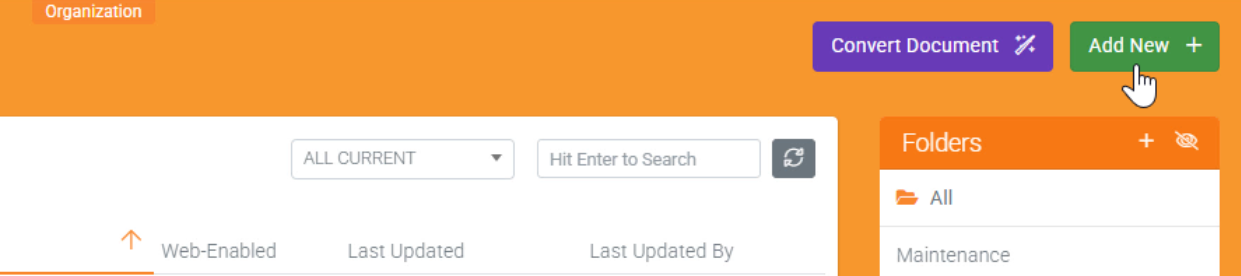
To create a new Form, use the “Add New” option available in the top-right corner of the page.
Creating a new Form
Create a new form in a few simple steps.

- Name:
Enter a name for the Form.
This is the default name that will be shown to app users. - Icon to Display:
Choose an icon to display to app users.
This helps with quickly identifying your Form for your users in the field. - Bind to a Data Source (optional) :
Binding to a Data Source will automatically generate fields for you based on the columns found, giving you a quick way to get started with a new Form. It creates a form that includes a choice field populated with rows from the selected Data Source. Additional fields are automatically linked to the columns, allowing you to display the corresponding values from each selected row. This functionality is useful for building forms that present and interact with Data Source content in a structured format.
Then hit “Create“, taking you to the form’s designer.
Examples Catalog
Or, if you prefer to get started with an example app and tweak it to your liking, navigate to our Examples Catalog (Side menu > App Workshop > Examples Catalog) for some How-Tos or industry-specific applications that can be installed.