Attachment Field Type
The Attach field is an advanced field type that allows documents or files (up to 25MB) on a user's device to be added to a form as an attachment for output. Alternatively, a file can be downloaded from a specificed URL.
Note: Attached PDFs can also be embedded into custom outputs when form-captured data is output in PDF. Add an Attach Field
Simply drag 'n drop an Attach field or left-click from the list of field types (left) to add it to the design preview (center), then configure its properties (right).

Besides common field settings, a few unique Attach field properties might be of interest under the field's Advanced Options:
Property | Description |
File Name | By default, the app will generate a date-based name for each file captured by the user. Use this property to define your own file names using our template syntax for dynamic generation. The file extension is automatically added by the system based on the file type. Example: STOCK-{{mychoicefield}}-{(USERLASTNAME())} |
Limit File Types | Enter a comma-separated list of file types to allow. If this field is left empty, then any file type supported by the device can be selected. |
Download From URL | Instead of capturing the file from the device, the file is downloaded from the specified URL. This is useful for cases where other apps or external devices can provide files via an https:// or other URL schemes. Note: You can use field references in your URL, e.g. https://{{otherfield}}/getimage |
Basic Properties
Data Name
This is the name of the field that should be referenced in any form logic or API calls. Users will not see this name on the form.

Data names cannot contain spaces or any special characters other than an underscore and must begin with a letter. They are case-sensitive and must be referred to precisely whenever they are referenced.
Title Text
This is the name of the field that will be displayed to users on the app. This property is completely optional; while a field must contain a data name, a field title is optional.
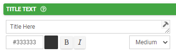
The text color may be chosen with a hex code. The text may be also formatted as Bold or Italic and given a relative size -- Small, Medium (the default), or Large.
Hint Text
This optional field can be used to show secondary information to the user in the app. Consider using this to provide instruction or clarification to the user as they fill out the field.

Formatting options for this property are the same as those given available for the Title Text property.
Layout & Styling
Field Layout
This drop-down determines how this field is shown on the screen.

- Vertical places the Title and Hint vertically above the entry field.

- Horizontal will stack the entry field to the right of the Title and Hint text.

- Horizontal (Tablets Only) will use a Vertical layout for phones and Horizontal for tablets.
Background Color
The color chosen in the hex code field here will apply to the field. The Transparent box can also be chosen instead for making this transparent instead of a solid color.

Validation & Behavior
Required
Checking this box will enforce validation against this field to make the field required, disallowing the user from progressing to the next page or submitting the form if it is left blank. If the user tries, they will be prompted with an error to return to the field and enter a value. When this validation occurs is determined by the "Validation Property" chosen on the page level; please see this article for more detail on this.
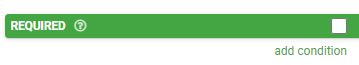
This property can also be made conditional based on a formula. To enable this, click "add condition" below the checkbox and enter a formula into the field that populates. The formula serves as the basis of the requiredness of this field.

Please see this article for more information on conditionally-required fields.
Visibility
The contents of this field will determine whether the field will be visible to the user. For more detail on visibility rules, please see this article.

Dynamic Value
This property is used to define a calculation/formula that will populate the field's value. Often this is used in conjunction with the "Read Only" property (see below) so that the field will calculate and display to the user without the possibility of manual edits. This article is recommended as a starting point for more reading on this.

Please see this article for details on the relationship between Default Value and Dynamic Value.
Read Only
If this checkbox is checked, users will be able to see the contents of the field but will be unable to make edits.
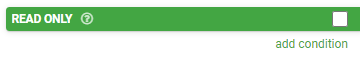
Similar to the Required property, the Read-Only property also includes the ability to define a conditional formula determining whether the read-only property is enabled. Click "add condition" to define such a formula.

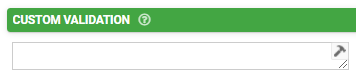
Custom Validation
Add your own custom formula to this property for validating text entered into this field by users. The formula is only applied when the field has an answer. Enforcement will be done according to the "Validation Property" chosen on the page level; please see this article for more detail on this.
Validation Message
The contents of this property will serve as a custom message to display to the user if their input fails validation.

Advanced Options
Default Value
The value entered in this property serves as the initial value of the field prior to manual input. Please see this article for details on the relationship between Default Value and Dynamic Value.

Bind to Data Source Column
This property allows for the binding of the contents of the field to a data source that is linked to either a choices field or data field on the form. For details, please see the screenshot below:
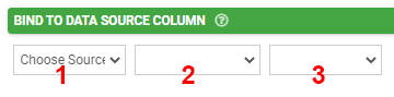
- The data source can be selected with this dropdown. More than one will be available if multiple data source control fields (choices fields or data fields) have been added to the form.
- The data source control field can be selected from this dropdown. More than one will be available if multiple data source control fields for the same data source have been added to the form.
- The column on the data source to be bound can be selected from this dropdown.
Data Source binding allows you to create forms that can load data from, and update data to, any given data source. This opens up amazing opportunities to have dynamic data that is updated on the move (e.g., adding contacts or clients). For more information, please see this article.
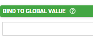
Bind to Global Value
Global Values are a local key/value store that is available on any Screen on the app. Use this property to allow the user to view and save defaults for use across the app (e.g., a default project or customer). Please see this article for more information.
Exclude from Export/Display
By default, every field is displayed on Form entries in the Data area, and is included in non-templated exports (e.g., generic pdf, CSV, spreadsheet, database connectors). Use this property to prevent this field from showing on all such displays and exports.

Is Personal Data
This indicates that data captured in this field may contain personal or sensitive data, which in turn can be anonymized when exported from the platform when then the "Anonymize Personal Data" option is checked on a form connector. Please see this article for more on this.
NOTE: Use of this option does not grant or imply additional security, protection, and privacy of data.

File Name
This property is used to define a dynamic, custom file name for the captured signature using template syntax -- e.g., STOCK-{{mychoicefield}}-{(USERLASTNAME())}. The file extension is automatically added by the system based on the file type. Consider also using metadata fields to add further specificity to file names.
By default (if this property is left blank), the app will generate a date-based name for each file captured by the user.

Limit File Types
This field can be used to enter a comma-separated list of file types that will be allowed to be attached. Creating specific limits for file types can prevent a user from uploading something malicious, such as a .zip file containing viruses or other unwanted attachments.
If this field is left empty, then any file type supported by the device can be selected.
Download from URL
This property sets a file to download from the specified URL, rather than capturing the file from the device. This is useful for cases where other apps or external devices can provide files via a HTTP:// or another URL scheme. Note that field references can be incorporated into URL - e.g., HTTP://{{otherfield}}/getimage.
Under advanced options for this field, as a screen designer, you have the ability to limit file types and download from a URL. The file types and URLs can also be data-driven; that is, their values can be driven by other fields in the form screen.
Attachments and Output
Unlike photo or signature controls, there is no way to include a document inside your document template fully. If you need an image of your document to show up inside a Word or Excel output design, please take a photo of a document and include that as a separate media field. If your form screen includes a connector, such as an email connector or other file storage to Dropbox, Google Drive, etc., you can select the box to "Send Media Files Separately" and, in that connector, all media files, file attachments, and signatures will be attached separately. If the attachment you include in your form is a PDF document, for example, that will be sent alongside your connector document, if you have one using a template.

If you do not want to send media files separately, because too many files are part of the document, or because you want it all contained in a single output report, such as a PDF, you may want to consider using a hidden field to capture the URL of where the file exists. In this instance, you can use a hidden or other text field along with the function FILEURL({{mediafield}}) in order to associate the file attachment directly in an output template, such as Word or Excel, which may be converted into PDF on any specific connector.
Example: Say you have a floor design document that you attach to a work order, and the attachment field is called {{FloorDesign}}. You can create a hidden field for the exact URL location of any PDF attachment. For the hidden field, say that is called {{HiddenURLField}}, you will use the formula FILEURL({{FloorDesign}}).
Your output document will then reference this hidden field using the following formula:
Word Template:
{( LINK(‘Click here’, {{HiddenURLField}}) )}
Excel Template:
{{( LINK('Click here', {{HiddenURLField}}) )}}
Alternatively, you may substitute the static text in quotation marks for the data name of a field with text to be shown instead. For example, if you have a hidden or other field named {{textHere}}, your formula on the output would be:
Word Template:
{( LINK({{textHere}}, {{HiddenURLField}}) )}
Excel Template:
{{( LINK({{textHere}}, {{HiddenURLField}}) )}}
Whether you are sending a Word, Excel, or PDF document in your connector, the text will be a link to the attachment. This is a powerful capability to attach and utilize additional documents or other files inside your form screens.
Related Articles
Sketch Field Type
A Sketch Field Type can be used to capture signatures, or to annotate images or drawings. Configuring the Sketch Field Type Simply drag and drop a Sketch Field from the left-hand tolbar onto your Form page and configure it using the right-hand ...Gallery Field Type
TABLE OF CONTENTS Layout & Styling Background Color Validation & Behavior Required Validation Behavior Gallery Item Limits Output Gallery Field Data in a Custom Word/Excel Template This is an advanced field type that allows a user to upload multiple ...Date/Time Field Type
TABLE OF CONTENTS Basic Properties Data Name Title Text Hint Text Date/Time Type Working with Date & Time values in formula and bound Data Source scenarios How to get Date & Time values stored in your local time zone Layout & Styling Field Layout ...Section Field Type
TABLE OF CONTENTS Basic Properties Data Name Title Text Hint Text Static Image Dynamic Image Layout & Styling Background Color Validation & Behavior Visibility The section field is a read-only field type that lets you display text and/or an image in ...Numeric Field Type
A numeric field may be used to capture and display numeric inputs in decimal or integer format. Basic Properties Data Name This is the name of the field that should be referenced in any form of logic or API calls. Users will not see this name on the ...