Map Screen Type
The Map Screen Type is one of our data perusal screens. This screen type is data-driven and enables you to visualize data with a GPS component on a map.
To add a details screen, navigate to Apps -> Screens. Click on the ADD NEW+ button.
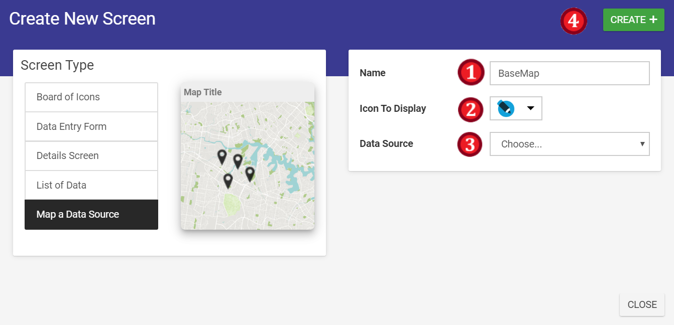
- Name your Map Screen
- Select a suitable icon
- Select your data source (optional)
- Click on the CREATE+ button
Configuring the Title bar
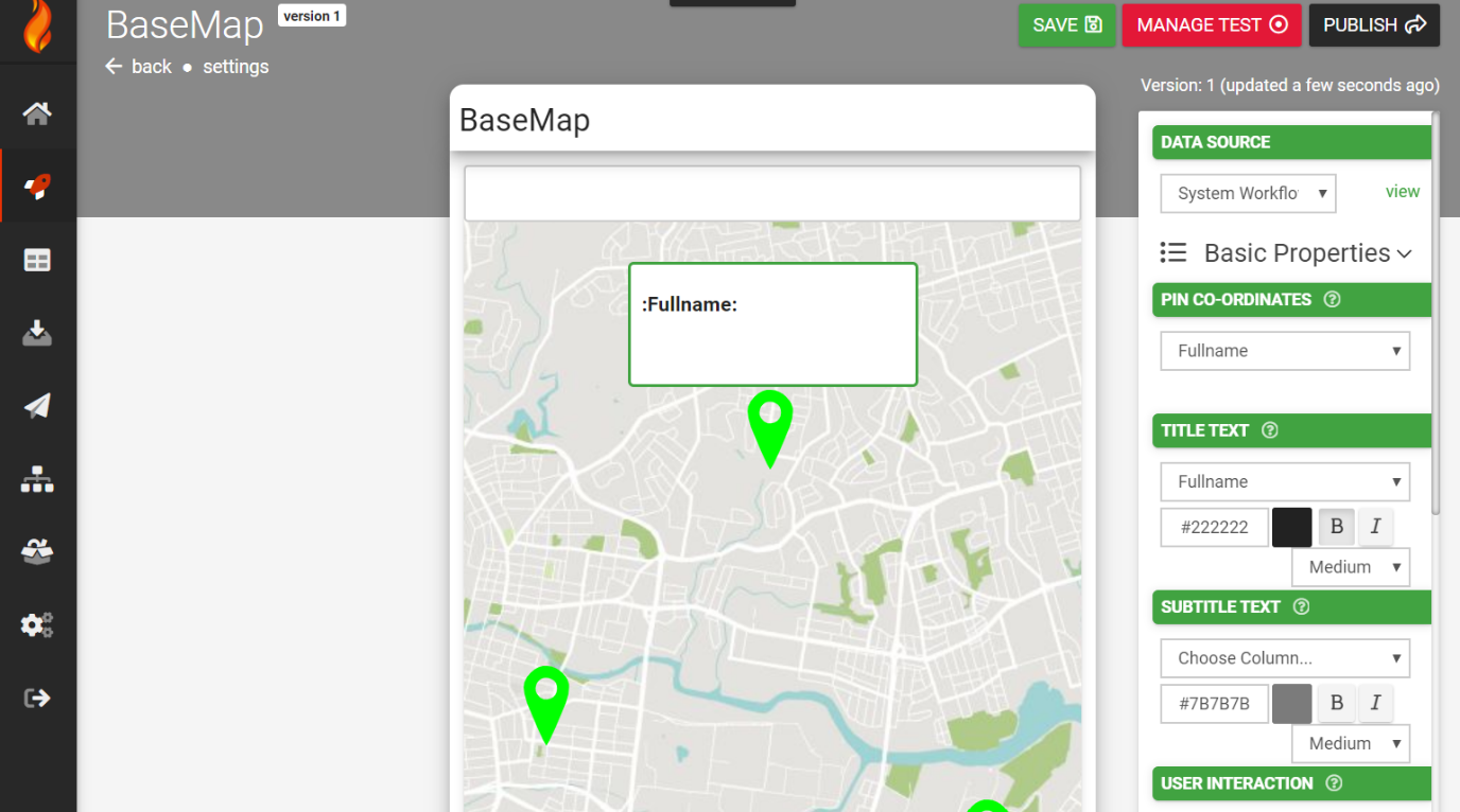
- Data source - A selection of connected data sources within your app to which to relate your configuration.
- Screen Title - This will be populated with the name of your screen.
- Map Type - Standard, satellite and hybrid are the options, with hybrid being a combination of the previous two.
- Show Users Location on Map (Check Box) - If users’ GPS co-ordinates are available, checking this box this will create a pin on the map for them.
- Action Buttons - Define buttons to appear on the title bar.
- Select which button you'd like to configure: LEFT, RIGHT1 or RIGHT2
- Select an icon
- Add the button text
- Select the button colors
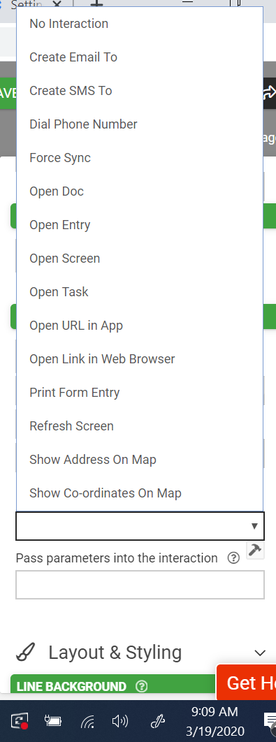
- Select the user interaction. E.g.,
- Visibility selection check box
Search Field (directly below title)
- Data source - a selection of connected data sources within your app to which to relate your configuration of the detail line.
Basic Properties
- Show Search Box (Check Box) - If the check box is selected, the search box in the screen being interfaced will be displayed.
- Allow User to Filter by Column (Check Box) – If the check box is selected, screen users will be allowed to create and apply filter rules for search results.
- Users Filters Override Default (Check Box) (Only visible if Allow User to Filter by Column Check Box is selected) – If the check box is selected, user filters are applied to search results despite default settings.
- Left Text – Static text and dynamic values related to the data source can be entered here. Color, font and text size can also be adjusted.
- Left Icon – The icon image displayed for this detailed line. Having no icon selected for display is also an option.
- Right Text/Button – Same as left text and left icon combined but on the right-hand side of the field. Color, font and text size can also be adjusted.
A user interaction can also be configured with the same choices as above.
Validation & Behavior
- Search Pattern - By default, searching will filter rows based on the user's search text matching anywhere within the displayable row values. This option allows you to specify a replacement regular expression for row matching. Use {{this}} to refer to the user search text in your regular expression. E.g., '^{{this}}' will show rows that start with the search text.
- Default Filter - Allows you to specify the default filter formula for this screen. Any incoming filters will override any default filter specified. E.g., {{this[0]}} = ORGMETA('projectId')
Related Articles
NFC Field Type
The NFC field allows you to build Form screens that can read/write NFC tags using Android or iOS devices. NOTE: Read only supported on iOS devices NFC on Android: Examples: A form can read data from an NFC tag and pre-populate additional field values ...Barcode Field Type
TABLE OF CONTENTS Basic Properties Data Name Title Text Hint Text On Scan Action Layout & Styling Field Layout Background Color Show Inline Validation & Behavior Required Visibility Dynamic Value Read Only Custom Validation Validation Message ...Showing Data Source Rows on a Map (Mapping Screens)
The Mapping screen type provides the ability to display Data Source rows as map pins on a full-screen map in your apps. We’ve added customization options such as control over pin colors, callout display and user interactions to enable dynamic ...Chain Screen Types to Produce Deeper User Experiences
Make your apps more distinctive by taking advantage of our various screen types: Forms - Everything you need for general purpose data capture in the field. Listing - Versatile inquiry screens for your data sources. Add user interactions to jump users ...Details Screen Type
The Details Screen Type is one of our data perusal screens. This screen type is data-driven and enables you to visualize the rows in a data source. To add a details screen, navigate to Apps -> Screens. Click on the ADD NEW+ button Name your Details ...